
PK XD - UI/UX case study & redesign
This is an analysis of the mobile game “PK XD”. A freeform multiplayer game where players take control of an avatar to perform various activities.
The area of the game I decided to focus on was the First Time User Experience and the player guidance of that experience.
Below I discuss my workflow. I have broken it down to several sections where decisions or designs were made. I have included designs and content produced in each step of the thought process behind the workflow.
For this assessment I timeboxed myself and set a time limit of 8 hours.
Onboarding
Issue: The player is instantly thrown into multiplayer without warning or guidance.
The onboarding process in PK XD is non-existent. Multiplayer games like PK XD that has a lot of content need to be careful with how they introduce their players to the world. After customizing their character, the player is thrown into the game world with no warning.
The game world is also multiplayer and every other player is in this same world, which can feel daunting to new players. While freedom to explore is valuable, having no choices or explanations as to why things happen can lead to frustration.

The current user flow of the first time user experience for getting into the game.
The player is put into the games multiplayer world instantly without warning.
Proposed solution: Create a safe, accessible space for exploration.
If players want, they should be allowed to explore the game at their own pace. Instead of being thrown into multiplayer after customizing their character, we show the player some options of what they can do in the game, and let them pick and choose between those options.
On the right is a solution where we give the player the choice to jump into the multiplayer directly (as it is now), or allow them to explore the game solo. This could be forever, or until they feel confident or safe enough in the game to jump in with other players. The main focus is to give players the choice.
This solo space can be used to try different gameplay features like building your house, or trying out mini games without the competition factor the multiplayer world has.
I believe that this feature together with a robust tutorial system (mentioned below) can help players feel safe, more empowered to explore, and ultimately gain more enjoyment in the game.

Proposed user flow. Allow players the choice of playstyle. Players can at any time go between the different worlds.

Mockup to show how the game can allow players to pick their own style of play. I decided to stick with the games established colorful style and language.

Mockup showing how features can be introduce to the player in the same vein.
Tutorialization
Issue: No tutorialization of gameplay features.
The game contains a variety of mini games and features that players can experience. However, the game doesn’t help the player find those features. There are no signs or feedback that the player can use to guide them toward the games content. No type of tutorial exists either where the player can be guided toward features.
Depending on different content creators on YouTube, the games store page or other media, these features might be what drove the player to the game in the first place. Not knowing how to access it can lead to confusion and frustration.
The rollout mockup for new players to give them information on what to do in the game. This works well early on, but can be modified and expanded upon when the player is in the game world.
Proposed solution: Allow players to be guided through features and allow them to be guided toward objectives in the game.
One way to introduce players to gameplay features is to expand on the onboarding feature where we allow players to test different features and games . However, if the player has already jumped into the game, we can allow players at will to see a selection of features they can explore.
On the right I introduce a tutorial system called “Tutorial Tara”. Taras function is to in a friendly way tell players what they can do at any given moment.
Example on the right: if a player clicks on a mini game or feature, Tara will create a visual guide of arrows between the player, and the destination where they can play that mini game.
This navigation feature can be expanded upon to guide players toward anything that is deemed important. It’s a flexible system that doesn’t have to involve text, but could instead show pictures or videos of the feature in question.

By using the smartphone feature in the game, the player can open a menu with a list of things to do, presented by Tutorial Tara.

After clicking “Navigate” the player gets a navigation UI that helps them find where they need to go.
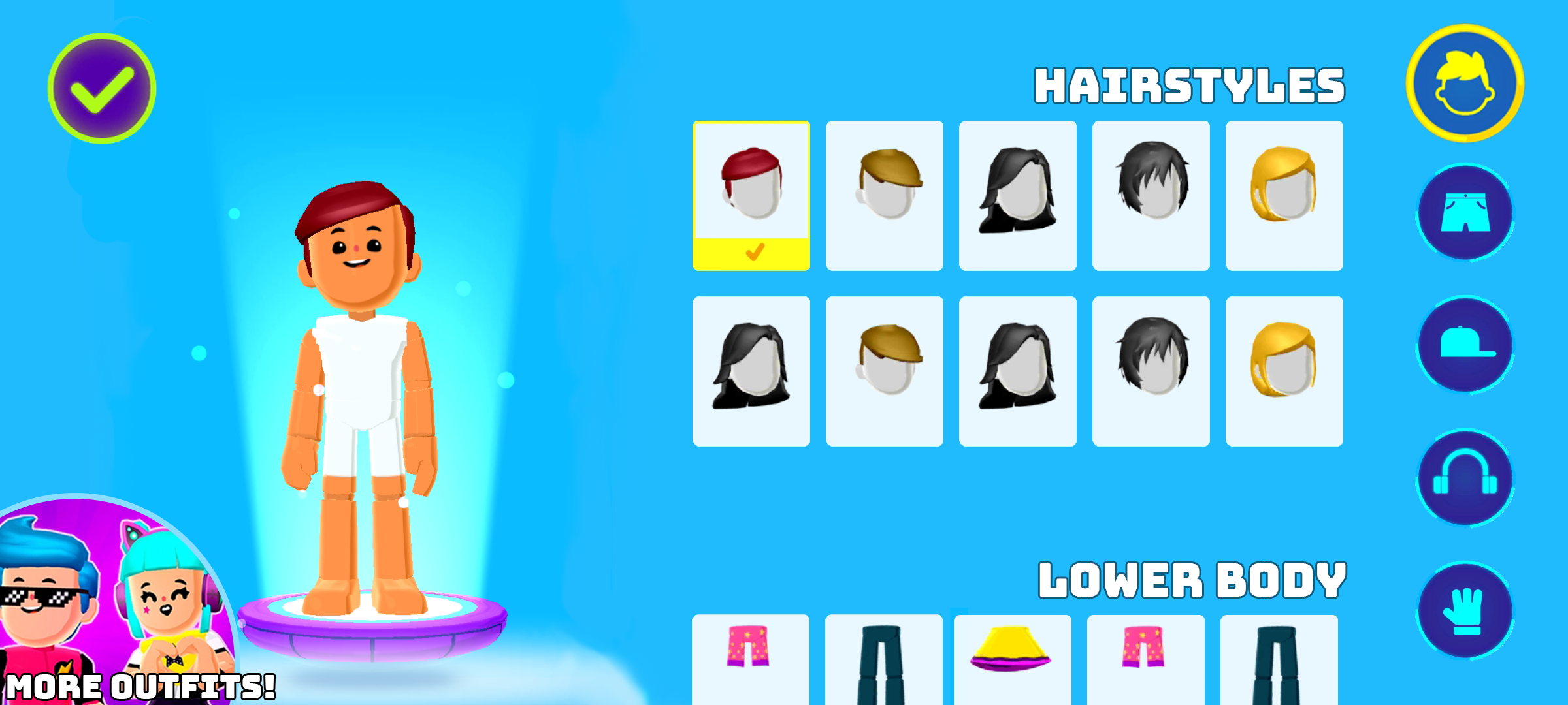
Monetization & UI readability
Issue: Monetization focus which impacts usability.
During the onboarding, the game promotes monetization in the very first screens. The player has a choice of five customization options, with more than 20 being behind a purchase. while monetization is needed for a free to play game, promoting it this early in a game can be handled better.
The character customization screens layout suffers because of the current focus, not allowing the UI to be focused on the customization but having to balance both gameplay and monetization. While the general layout works, there are a lot of unnecessary clicks the player has to make to navigate the different selections.
Ultimately, showing this many options and not having a concrete focus, can create decision paralysis and cognitive overload which can steer players away from the game.
The first screen the player sees. A lot of locked content is promoted to the player
Proposed solution: Streamline interactions & layout. Focus on existing options and de-emphasize paid options.
A list view such as character customization should utilize the swiping motion native to touch screens, but we should also allow players to quickly tap to their preferred section. On the right are two mockups utilizing the gestalt principles of proximity and similarity, without the need of the enclosure principle. This allows the UI to have a clear focus but still be readable.
This early in the game, players don’t know what the game is about or if they will even like it. We should promote the existing features the player has access to right now, but we can also tell the player that paid options exist.
In the example mockups I create a space where the player can go to the monetized section of the game. We allow it to be visible, but we do not put emphasis on it. If a player clicks the button, we also prompt them telling them they are entering a monetized section and handle warnings appropriately.

Message telling players that they are leaving the game and entering a monetized space. Shown after the player has clicked the “more outfits!” button.
Here I also use an easier to read font, as understanding this text is more important than keeping the style of the game.
Mockup showing how the screen can be streamlined. Allowing UI elements to breathe and enables both tapping and scrolling navigation across the whole UI.

Here the player has either tapped the “lower body” icon on the right, or scrolled far enough down to where it is highlighted automatically.
What UX solution has PK XD solved effectively?
The HUD and controls are accessible.
PK XD is a 3rd person game where the player controls an avatar in a 3D world. This being the case, the character controls are extremely important and need to be easy to use and understand. Being a mobile game the HUD is not just information, but also the controller interaction as well.
PK XD has balanced having a lot of important information displayed while keeping the HUD clean. The controls are easy to spot, and the left navigation controls do not require pin point accuracy. Instead by leaving the screen free of UI, the navigation controls can be activated from almost anywhere within the black and white border.
This makes it much more accessible for players with motor disabilities, as well as new or younger players who might not have refined motor controls.
The controls are not confined to where the UI is. The area in the white and black border can be clicked to navigate.
Player interactions made from the HUD are inclusive.
PK XD is a social game where players can interact with each other and the main language is english. Communication between different languages and ages can be difficult, and can create barriers between players. To combat this PK XD uses a communication system where players can pick between emojis and finished phrases.
While it might take some time to find what works for each situation, it evens the playing field for all players in their communication and doesn’t discriminate players who might not feel comfortable typing or talking themselves.

The players can pick between finished phrases and emotes that then are displayed above the characters head.
