Name
L.U.X in The Temple of Shadows
Tools used
Unity 2018
Perforce
Adobe Photoshop
Adobe Illustrator
Role
UI/UX Designer
UI Scripter
Game Designer
Product owner
Time
Seven weeks
Team Size
10
Contribution
UI/UX design
Game design
Level design
Production organization and planning
Summary
L.U.X in the Temple of Shadows is an adventure game where a scared robot uses the power of light to fight shadowy monsters. Use your flashlight and flares, manage your resources, and find all the fuel cells to get home! L.U.X was developed over 7 weeks at Futuregames.
Key Learnings
UI/UX design and scripting in Unity.
Creating, adapting, pivoting and communicating the games vision.
Supporting a multidisciplinary team.
Researching user feedback and analyzing it.
The Loadout system

First interaction with the loadout screen
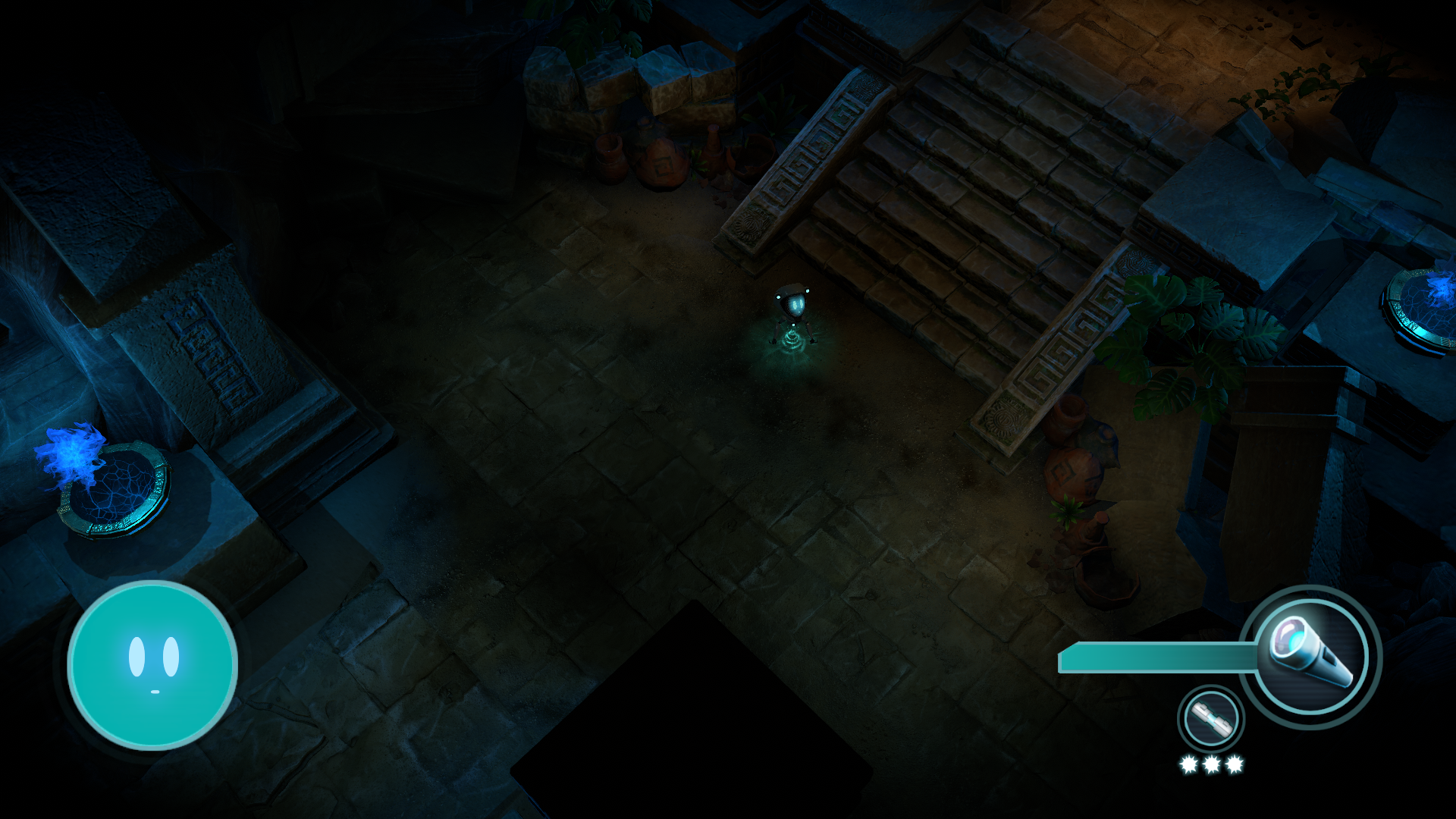
In the game the player can access their crashed ship to change their Loadout.
The goal was to create a natural way for the player to access the load out screen, that fit with the narrative and worldbuilding.
The solution was a diegetic approach to a holographic screen that would be enabled when the player interacted with the ship.
Here the player has interacted with the ship for the first time after the tutorial. After putting the battery in the ship, the screen comes to life with an animation. The camera pans down to put the UI in focus.
Discoverability & Usability
The player is free to interact with the ship whenever they want. When they are near the ship, an indicator lights up above the characters head to show that they can interact with it.
We found out after testing that players would sometimes not interact with the ship after inserting the battery. To make sure that the player knows about this feature, the loadout screen is activated automatically after inserting the battery, to let the player know that the system is now accessible, and that it can be accessed whenever the player wants to.
The creative process
prototyping
This was the first prototype of the Loadout which at this point was a power-up system. Whenever the player completed a challenge, they got to power up their arsenal. After pitching the power-up system with the design team I got tasked with prototyping it in engine.
Iterating early and often
In order to iterate quickly I rapidly updated the prototype to be able to show it to the team and iterate on it further based on their feedback. I had already set up the camera system so I used it to convey the feeling of the UI.
Playtesting & feedback
We found through playtesting that we would much rather have a Loadout that the player can access whenever they want, instead of only rewarding the player. That also helped the level designers to use the Loadout as the “hub zone” for the player and all the paths always led the player back to the Loadout “hub zone”.

Adding a battery to the ship, activating the loadout UI.
When near the ship an indicator is shown telling the player they can interact with it.

Early prototype of the UI.
The Main Menu

Setting the tone from the start
The main menu is what the player sees after the introduction to the game.
The goal was to introduce the player to the main character L.U.X , and what L.U.X is like: a scared robot that needs help getting home.
The solution was to have L.U.X stay near the camera, and follow the player wherever they went on the menu. Then when the player is ready to start the game, L.U.X follows the player in to the game. All of this is to reinforce the feeling that L.U.X is afraid.
The Creative Process
Prototyping & ideation
This is an early prototype of the main menu. It contains cut features, such as an option to change the appearance of the main character. The 3D artists played around with different appearances and wanted a prototype where they could change it before starting the game.
Knowing when to cut things
The changing of appearance got removed as we decided to focus on a smaller more polished experience, so the artists focused on creating one highly polished appearance, instead of several less polished ones.
Iterating on several aspects
The camera movement was in early prototype here, and was just set in place to show the rest of the team what feeling I was aiming for with the main menu. I also threw together some of the assets we had quickly to help the artists with the overall aesthetic of the menu.
The characters movements were prototyped using the animation system in Unity.

The games main menu.

Early prototype of the main menu.
The HUD
The flashlight
The Flashlight is the players primary weapon. While in use, it drains battery, and when it’s not used it recharges. The goal here was to tell the player how much battery they have left, how fast it drains while in use, and when it recharges.
The solution was to have a flashlight icon attached to a bar that fills and refills. The players eyes are usually on the character, so to tell the player when their battery was low, the flashlight and the battery bar starts blinking.
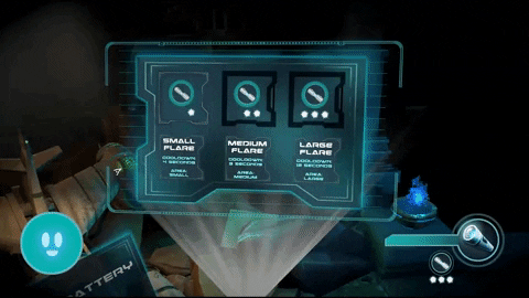
The flare
The Flare is the players secondary weapon. There are three different levels of the flare. When used, it shoots out a projectile that lands on the ground. It then recharges until it can be used again.
The goal was to tell the player what level the flare is, when it is usable, and when it is on cool down.
The solution was to have stars below the flare icon to indicate the level. To show the cool down a circle was used, that refills after the flare has been used. The flare icon also disappear while on cool down and bounces back when it’s usable again.
The scare meter
We wanted the character to be scared. To do this we introduced a scare meter, that would function as a health bar.
The goal was to differentiate the scare meter from a normal health bar, and to make sure it was visible to the player.
The solution was to have the characters face on the bar, which would change depending on how scared it was. To make sure that the player would notice when the character got scared, the meter would pulsate, to make it look like it’s heartbeat had heightened.
The creative process
Playtesting early
This is the first draft of the UI HUD. We liked the overall concept of it but through playtesting we found that the battery icon confused players more than helped them. It got removed from the HUD and added to the characters back in the world instead. This diegetic approach worked better and players understood it.
Collaborative iteration
This version of the HUD was located in the top right corner of the screen. I communicated the issues to the team and I made a quick mockup with these existing assets how we could improve on the layout, but keep the aesthetic intact. The layout became the above final version while we worked on replacing the assets which are in the final version.

The flashlight UI.

The flare UI.
The scare meter depleting.

Early prototype of the HUD with temp art.
The Camera
The goal was to create a camera that would fit with the game’s top down perspective. The camera also had to be discrete and give as much information as possible.
The solution was a camera that would ease in and out depending on the how the player moved and aimed. I decided to use a tool called Cinemachine, a plug in for Unity. I could then adjust and tweak it depending on player analysis, feedback and testing.
Using the right joystick on a gamepad, or moving the mouse around gives the player more information about the area they are looking at.
To create this the camera looks at two different points in the world, and aims at the center of them. One point being on the character, and the second a few units in front of the character.

The camera in game.

The camera in engine.
Project Management
As the product owner it was my responsibility to help create, adapt and execute the games overall vision. This included:
Help the team when they got stuck, proactively finding solutions to problems and make sure that everyone was working towards the milestones.
Adapt the SCRUM methodology to the teams needs, and listened to the teams feedback when they felt something could be improved.
I created and presented the game pitch to the stakeholders. I held the presentations and was the contact person of the team.
Made sure everyone on the team got their voices heard. Solved conflicts and scoped the project according to the teams velocity.